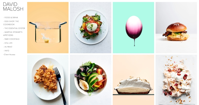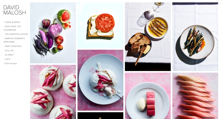
David Malosh is a NYC photographer who has worked on a number of projects, including shooting a cookbook with a celebrity, and telling the story about a local restaurant.
The creative potential of food is a constant reminder. He’s originally from Wisconsin and has built a successful career by photographing all kinds of food around the country. From coastal oyster recipes to fancy minimalist eggs, and everything in-between. Malosh is a photographer with a special talent. He creates images that are both simple and surprising.
The photographer put his playful and refined sensibility into action when it was time to design a website. He chose Squarespace as the website builder to bring his vision to reality. Malosh lets his images do the talking, which is why he has placed them at the forefront of his Squarespace website. It’s easy for you to lose yourself in his colorful and diverse galleries. Malosh talked to us about food photography, hosting and some of the secrets behind the scenes.
What is the reason you chose Squarespace for building a website?
“I chose Squarespace as it was easy to use. I am not a techie. I do not talk about the newest software or camera specs. Digital techs do that, and I am grateful for their technical expertise and skill. I wanted a website I could update myself that was easy to manage and flexible.
“I believe creatives tend to overthink their websites. We want them perfect. Photo editors and art buyers want to navigate your website quickly and see the images. I use a template called Wells, which I have modified slightly. Wells has a very simple design and navigation. The template has exactly what I wanted: an opening gallery with large single images. The portfolio website should not draw attention to itself, but rather showcase images. “It’s an effective website when people only see the pictures and the rest of the design is intuitive.”
